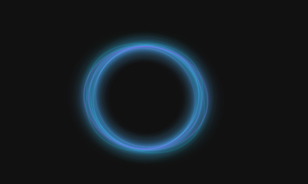
纯CSS3实现多彩波动动画
纯CSS3实现的多彩波动动画效果全部代码

<!DOCTYPE html>
<html >
<head>
<meta charset="UTF-8">
<title>纯CSS3实现多彩波动动画</title>
<style>
html, body {
  height: 100%;
}

html {
  background: #eee;
}

body {
  display: -webkit-box;
  display: -webkit-flex;
  display: -ms-flexbox;
  display: flex;
  -webkit-box-pack: center;
  -webkit-justify-content: center;
      -ms-flex-pack: center;
          justify-content: center;
  -webkit-box-align: center;
  -webkit-align-items: center;
      -ms-flex-align: center;
          align-items: center;
}

.box {
  width: 300px;
  height: 300px;
  border-radius: 5px;
  box-shadow: 0 2px 30px rgba(0, 0, 0, 0.2);
  background: #fbfcee;
  position: relative;
  overflow: hidden;
  -webkit-transform: translate3d(0, 0, 0);
          transform: translate3d(0, 0, 0);
}

.wave {
  opacity: .4;
  position: absolute;
  top: 3%;
  left: 50%;
  background: #0af;
  width: 500px;
  height: 500px;
  margin-left: -250px;
  margin-top: -250px;
  -webkit-transform-origin: 50% 48%;
          transform-origin: 50% 48%;
  border-radius: 43%;
  -webkit-animation: drift 3000ms infinite linear;
          animation: drift 3000ms infinite linear;
}

.wave.-three {
  -webkit-animation: drift 2500ms infinite linear;
          animation: drift 2500ms infinite linear;
}

.wave.-two {
  -webkit-animation: drift 5000ms infinite linear;
          animation: drift 5000ms infinite linear;
  opacity: .1;
  background: yellow;
}

.box:after {
  content: '';
  display: block;
  left: 0;
  top: 0;
  width: 100%;
  height: 100%;
  background: -webkit-linear-gradient(top, #ee88aa, rgba(221, 238, 255, 0) 80%, rgba(255, 255, 255, 0.5));
  background: linear-gradient(to bottom, #ee88aa, rgba(221, 238, 255, 0) 80%, rgba(255, 255, 255, 0.5));
  z-index: 11;
  -webkit-transform: translate3d(0, 0, 0);
          transform: translate3d(0, 0, 0);
}

.title {
  position: absolute;
  left: 0;
  top: 0;
  width: 100%;
  z-index: 1;
  line-height: 300px;
  text-align: center;
  -webkit-transform: translate3d(0, 0, 0);
          transform: translate3d(0, 0, 0);
  color: white;
  text-transform: uppercase;
  font-family: 'Playfair Display', serif;
  letter-spacing: .4em;
  font-size: 24px;
  text-shadow: 0 1px 0 rgba(0, 0, 0, 0.1);
  text-indent: .3em;
}

@-webkit-keyframes drift {
  from {
    -webkit-transform: rotate(0deg);
            transform: rotate(0deg);
  }
  from {
    -webkit-transform: rotate(360deg);
            transform: rotate(360deg);
  }
}

@keyframes drift {
  from {
    -webkit-transform: rotate(0deg);
            transform: rotate(0deg);
  }
  from {
    -webkit-transform: rotate(360deg);
            transform: rotate(360deg);
  }
}
</style>
</head>
<body>
<div class='box'>
<div class='wave -one'></div>
<div class='wave -two'></div>
<div class='wave -three'></div>
<div class='title'>Capacities</div>
</div>
</body>
</html>